On this page
Several reasonable proposals can produce an unsafe control cycle. A service needs more replicas, a task could move to a healthier node, the provider could reclaim spare capacity, and another request is waiting for admission. Each proposal may fit the same snapshot. Once one executes, the others need to be checked against the state it leaves behind.
Cloud Orchestrator organizes this problem into six implementation layers and eight specialist roles. A shared contract determines who owns each operation, which proposals are feasible, and how an uncertain write blocks later work. Forecasts help the specialists reason about pressure; the control boundary determines whether their proposals may execute.
The overview brings those responsibilities together without collapsing them into one success indicator.
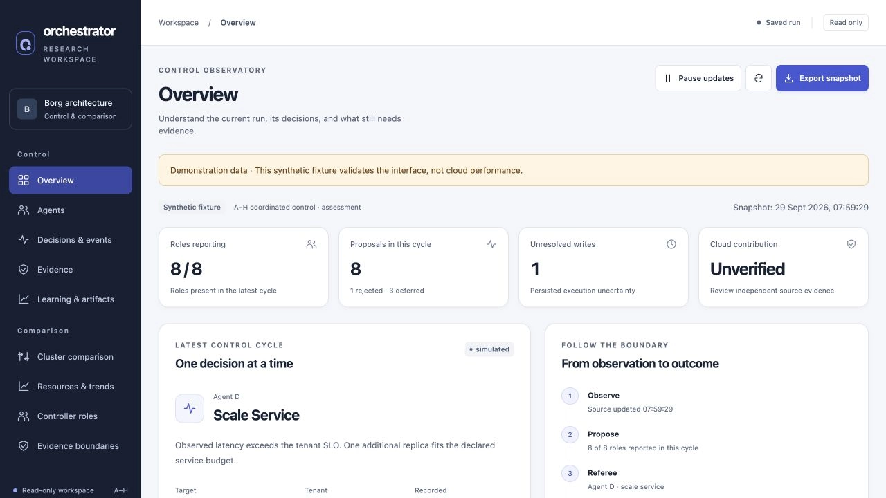
Current interface captured on 29 September 2026 from an explicitly synthetic saved fixture. These screens explain the dashboard and control model; no live cluster or measured performance result is represented.
The sidebar retains the source application’s “Borg architecture” workspace label. Cloud Orchestrator names the wider control and evaluation project described here.
Six layers organize the work
The layers describe responsibilities rather than six autonomous agents:
| Layer | Responsibility |
|---|---|
| 1 — Collection and adapters | Trace, Kubernetes, and Prometheus ingestion; independent offered-request collection; owned native actions |
| 2 — State and simulation | Causal datasets, bounded observations, persistent simulation state, and AIOpsLab adaptation |
| 3 — Prediction | Next-window risk and demand, with model provenance checks |
| 4 — Policy and coordination | Specialist proposals, feasibility, Referee arbitration, optional ranking, and the explicit legacy training path |
| 5 — Development search | Policy configuration search against a fixed validation objective |
| 6 — Evaluation | Outcome records, descriptive statistics, independent experiment acceptance, and role assessment |
The runtime follows observation → prediction → proposals → feasibility and arbitration → backend action → next observation. This sequence gives each record a place in the control cycle. A reward describes the post-transition observation; an action record describes what the controller attempted. A later outcome measurement is needed to connect either one to service behavior.
Layer boundaries also do not imply deployment permissions. A collector and an actuator can live under the same source directory while requiring separate identities and write authority in a real experiment. Current architecture and module boundaries
Agent names represent ownership
The default coordinated mode uses constrained deterministic specialists. It does not run eight PPO policies, and it does not depend on an LLM to diagnose incidents or judge acceptance.
| Role | Decision responsibility | Mutation authority |
|---|---|---|
| A — Recovery | Corroborate recovery needs; route sizing to D and movement to E | Bounded restart when the evidence supports it |
| B — Provider capacity | Preserve reservations, admitted load, allocations, and headroom | Provider CPU allocation envelope |
| C — Admission and fairness | Consider tenant limits, budget, deadlines, weighted sharing, and queue age | Admit, queue, or reject a specific offered request |
| D — Service sizing | Balance latency, readiness, budget, and bounded change size | Service replicas and CPU/memory sizing |
| E — Placement | Find feasible nodes under readiness, capacity, affinity, risk, and failure-domain constraints | Initial placement or rescheduling |
| F — Interference | Identify fresh multi-tenant contention | Advice to E; no mutation |
| G — Incident diagnosis | Form a bounded hypothesis from scoped structured evidence | Advice to A; no mutation |
| H — Accepted DAG coordination | Dispatch dependency-ready tasks within deadline, age, and concurrency limits | Mark accepted-DAG tasks runnable |
The division becomes concrete when several roles notice the same problem. A routes a memory-recovery request to D, which owns sizing. H can make a dependency-ready task runnable, while admission remains C’s responsibility and placement remains E’s. F and G supply advice to those action owners. The controller can therefore inspect each proposal without giving every specialist access to every control variable.
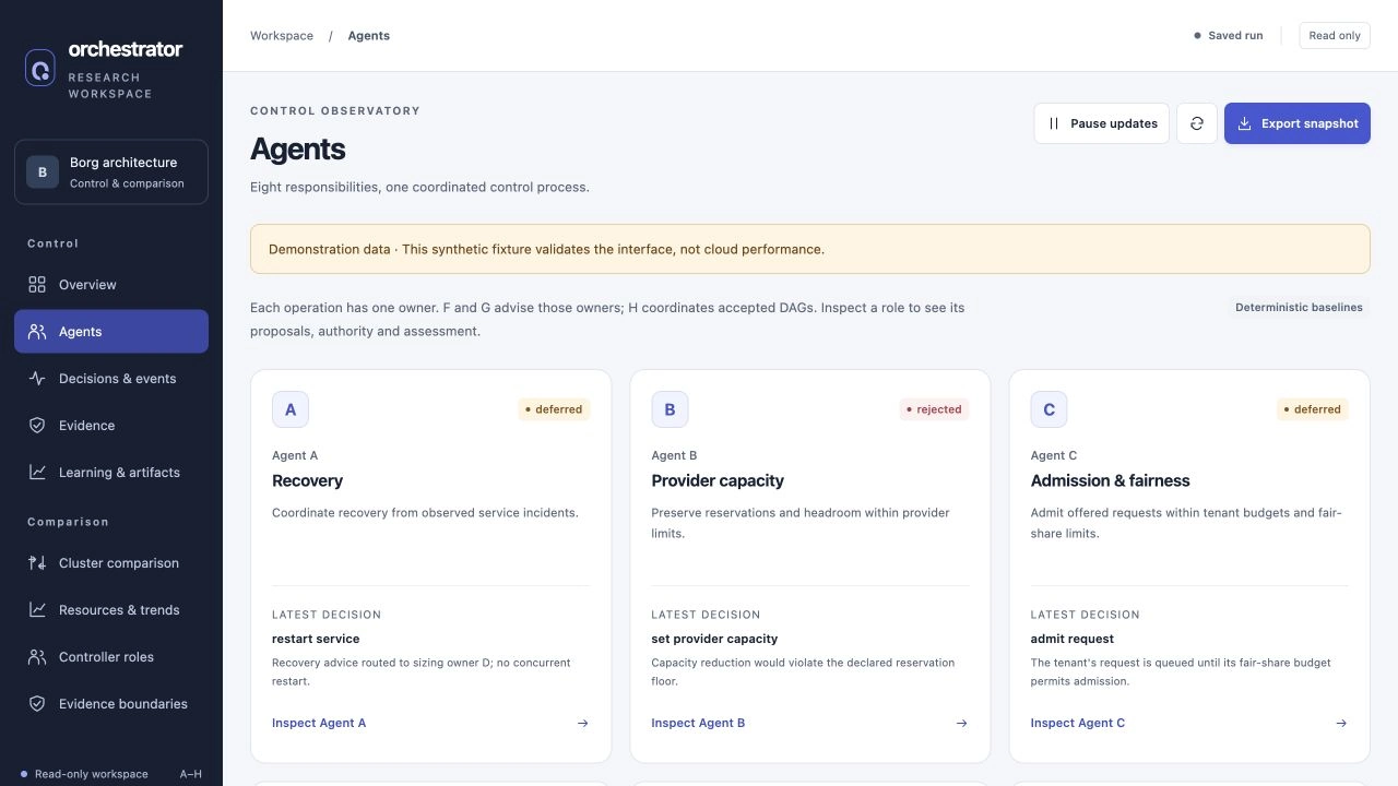
The first row of the Agents view shows A, B, and C in the same synthetic preview. The full view continues through H; each card describes a responsibility rather than a separately trained model.
Cloud service customer (CSC) and cloud service provider (CSP) describe stakeholder perspectives across these decisions. They are not alternative names for A and B. A deployment that separates customer and provider authority must enforce those contracts and permissions outside the Python role classes. Ownership specification
A proposal must explain where it came from
The controller parses a versioned application/provider snapshot. F and G produce advice, A routes recovery needs, and the action owners construct proposals from that state. A proposal carries its owner, target, tenant, snapshot revision and digest, expiry, evidence references, service binding, and advisory parents.
Those fields make the recommendation checkable against the observation that produced it. The validator rejects stale state, unknown tenant scope, and targets outside operator control. It also prevents the controller from quietly becoming a second writer for a Deployment already owned by an external scaler. The proposal’s score is considered only after these conditions are satisfied.
The same shared validation module is used before arbitration and execution. It has no model or infrastructure dependency, so the rule “this role cannot change that control variable” stays stable as policies evolve. Provider contraction must leave room for existing reservations and admitted work. Placement requires a valid destination. H cannot bypass dependencies or concurrency limits. Missing measurements remain missing.
The recovery path is similarly specific. Fresh out-of-memory evidence can request a bounded memory increase even if utilization has fallen after a crash. Reaching the configured memory ceiling leaves the incident unresolved; it does not justify substituting unrelated replica growth. A diagnostic hypothesis remains a hypothesis until later evidence confirms it.
Why I select one mutation at a time
The Referee first protects recovery, then handles admission and fairness alongside service, placement, and workflow work. Provider contraction has lower precedence. Feasible waiting resources gain bounded age priority, but age never overrides recovery or feasibility.
Only one mutation is selected for each observation. If D adds replicas, E’s capacity calculation and B’s contraction proposal may already need a new snapshot. Executing several proposals as a batch would require reservations, a way to establish which operations can safely commute, and a transaction protocol across adapters.
I chose serial execution to keep each transition small enough to inspect. The tradeoff is control throughput, and the policy still needs workload-specific evaluation under overload. What it gives me is a clear point at which to observe the effect of one operation before deciding on the next.
Sizing, restart, and movement share a service cooldown. Contraction requires three distinct healthy observations, and startup time can extend the wait. These guards remain in force when the optional learned ranker participates; learning can rank eligible proposals without removing the operational rules.
A timeout cannot become permission to retry
The most dangerous execution state is often uncertainty. Suppose the controller sends a native operation, the remote system accepts it, and the response is lost. Repeating the operation after restart can create a second effect even though the first call appeared to fail locally.
The controller records and flushes intent before making the native call. Its execution journal has a single-writer lock. Pending, submitted, and unknown results block further changes to the same resource, including after process restart.
That journal cannot solve distributed exclusion by itself. Gateway servers must also enforce atomic revision and digest preconditions with durable idempotency. The client performs a fresh read, sends once with those preconditions, and reads again to verify the postcondition. HTTP acceptance is recorded separately from verified completion.
Rollback of a learned policy preserves this journal. Reverting a model must not make an uncertain infrastructure write disappear. Coordinator implementation
The adapter determines what can actually happen
The native Kubernetes adapter supports owned exercise Deployments and bounded replica, resource, rescheduling, and restart operations. It checks resource versions, conflicting HPA ownership, conservative headroom, and applicable rollout or placement postconditions. It rejects protected traffic generators and collector workloads.
Provider allocation, application admission, DAG dispatch, and initial placement use versioned gateway clients. These clients exist in the repository, but their corresponding gateway servers, queue consumption, worker dispatch, and provider permissions are deployment responsibilities. An installed HTTP client cannot create those capabilities.
The coordinated state simulator has a different boundary again. It can change declared control state and retain offered requests, but it cannot manufacture successful requests, service recovery, billed cost, or measured energy. Its output is useful development evidence with a limited physical interpretation. Native Kubernetes adapter
Read the dashboard along the control cycle
Control at / and Comparison at /comparison/ share one dashboard origin on port 18765. The common sidebar links nine views, so I can move from the control overview to proposals, decision events, evidence, learning records, and comparison trends without opening a separate monitoring server.
I read these views in the same order as a control cycle. The overview establishes which run and source are displayed. Agents explains responsibility and proposal state. Decisions and events records selection and execution, while Evidence keeps imported assessment and unresolved journal entries visible. Learning and artifacts identifies the reported policy and development records.
Four questions guide that reading: what was proposed, what was attempted, which postcondition was verified, and what was independently measured? Those answers can arrive at different times. A pending or unknown write should remain visible even when the model has changed, and absent SLO or reward evidence should remain unavailable.
The interface reads the configured sources; changing views does not start a controller or create its state. Comparison can read a saved snapshot without contacting Kubernetes, while live collection requires explicit opt-in. Pausing display updates freezes the view, not the controller. Dashboard rendering and source semantics, unified server
The Referee is not the evaluator
The Referee decides which operation is feasible now. The independent evaluator recomputes whether a frozen controller improved a declared customer or provider outcome. It reads request ledgers and provider accounting and has no actuation role.
Per-agent assessment follows the same separation. A role can produce valid proposals without proving that it caused the overall improvement. Contribution requires a preregistered comparison that substitutes one safe baseline role while holding the remaining policies, Referee, scope, workload, capacity, and fault schedule fixed.
For each new capability, I need an identifiable state, an action owner, an execution contract, and a way to evaluate the result. The six layers organize the implementation; A–H organize control responsibility. Together they let me follow a decision from its input to its unresolved questions, which is the foundation the learning and evaluation paths depend on.
Previous: Part 2 — Prediction Contracts. Next: Part 4 — Tuning and Measuring the Controller.
Implementation references link to a pinned snapshot of the private research repository and require repository access.