On this page
A promising dashboard is the beginning of an investigation. Lower resource use might mean greater efficiency, or it might mean that less work was admitted. A smaller Pending queue might reflect faster scheduling, or fewer requests reaching the system. Even a higher reward can come from changing its weights while leaving the policy unchanged.
I use Cloud Orchestrator’s development tools to answer three questions separately: which policy is worth testing, what did its action actually do, and did the frozen controller improve the declared customer or provider outcome? Optuna and Ray/RLlib support the first question. Execution records address the second. The independent comparison protocol addresses the third.
There are two policy paths
The default coordinated controller uses A–H deterministic specialists and can add an optional central ridge-regression ranker. It does not train eight PPO agents.
Ray/RLlib belongs to the explicit legacy_abc path. That path retains three policies with role-specific observations and action categories. A deterministic decoder chooses concrete targets; a checkpoint cannot bypass target feasibility or silently enter the A–H controller.
The legacy trainer performs optimizer iterations, saves an algorithm checkpoint, and exports frozen modules for inference. Curriculum stages restore the preceding checkpoint rather than restarting the policy at each stage. A saved-and-restored module test verifies serialization and inference; it is not evidence that a complete optimizer curriculum has been run and evaluated in the cloud.
I keep the training record explicit about that progression: support for PPO establishes an implementation path, restoration establishes artifact behavior, and a completed training run produces a candidate. Its operational benefit still needs evaluation. Legacy trainer
Reward tuning needs a fixed ruler
The runtime skips reward-only search when the action policy is a fixed heuristic. In that case, changing the scoring weights changes the reported objective without teaching the controller to choose differently. A useful tuning experiment must change the policy and keep a fixed basis for comparing its behavior.
The supported legacy policy search uses candidate training weights while evaluating every candidate against the original fixed validation objective. Training weights are normalized, objective values must be finite, and categorical search spaces remain stable across a persistent Optuna study. Study identity binds configuration, temporal partitions, and predictor artifacts so an incompatible experiment cannot reuse a name and quietly inherit its trials.
Optuna selects configurations. RLlib performs the policy optimization. The coordinated A–H mode skips that legacy search and uses its separate learning path when configured. The distinction is visible in the entrypoint, not just in the dashboard label. Runtime training and tuning branches, Optuna implementation
Reward itself is development feedback. It comes from the transition outcome, not a bonus for choosing an impressive action name. A proxy reward can help debug policy behavior without becoming a measured tenant SLO or an independent research result.
What the local comparison is for
The local setup uses borg-experimental and borg-baseline Kind clusters. The names are retained runtime identities, while Cloud Orchestrator is the project’s current public name.
The two clusters are useful for observing control behavior under matched offered load and capacity. The baseline allows HPA scaling within the declared range, and the optional warm-node activation demonstration is disabled by default. This local setup can exercise the workflow; evaluating AWS Karpenter’s actual provisioning behavior requires a cloud experiment with that service.
After verifying the project’s registered ports and exclusive ownership of the shared clusters, the documented launch is:
OPEN_BROWSER=0 MODE=fast ./orchestrator_stack/scripts/start_local_dual_cluster_stack.shThe architecture checkout serves one dashboard on http://127.0.0.1:18765/, with comparison at /comparison/. Starting a second manual comparison server is unnecessary. A dashboard-only preview instead requires a saved source and does not fall back to live Kubernetes when that source is missing. Launch and ownership instructions
Use resource trends to form a question
The current Resources & trends view puts CPU, memory, Pending pods, and estimated dynamic power on separate charts. It also retains the source’s sample order and reports both the available sample count and the plotted count. That context matters when a smooth chart is drawn from a limited history.
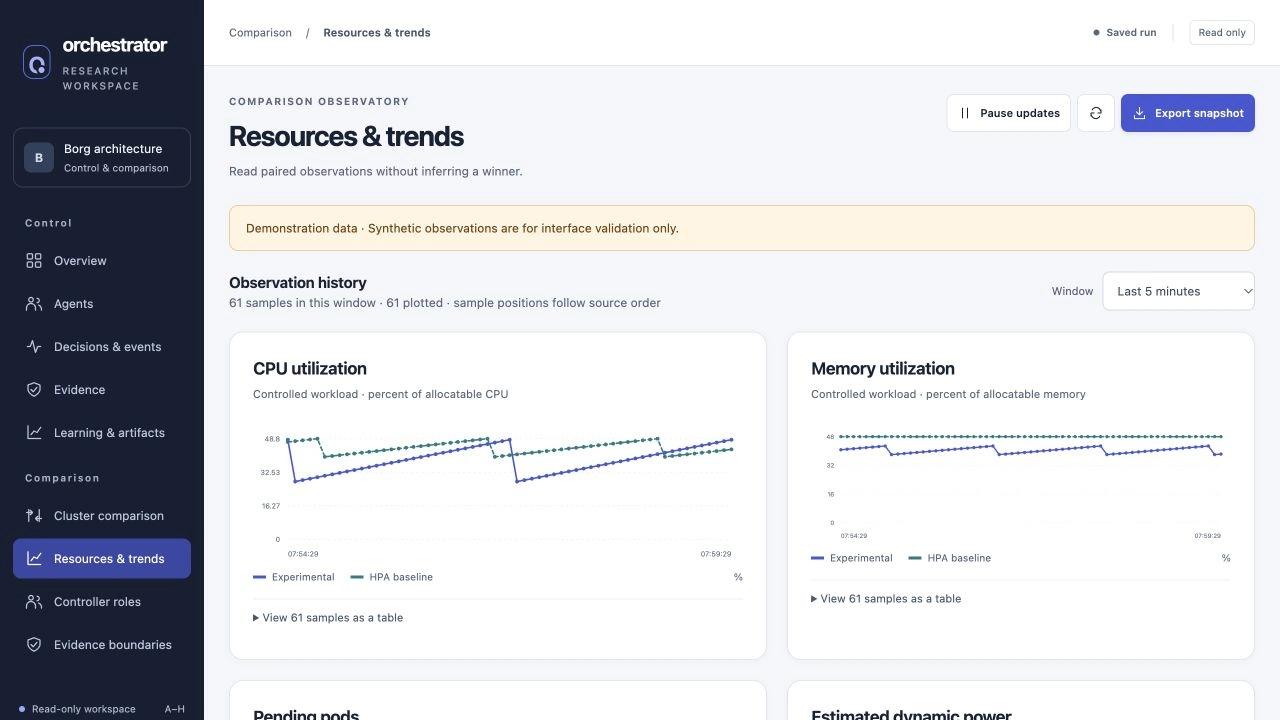
Current interface captured on 29 September 2026 from an explicitly synthetic saved fixture. The paired curves demonstrate the comparison view; they are not measurements from a new cluster experiment.
These charts help locate a period worth investigating. I would look for the offered workload, admission decisions, capacity, and execution record behind a change in Pending pods before interpreting it as better scheduling. CPU and memory can then help explain the transition. The dynamic-power panel remains an uncalibrated estimate, so its curve cannot establish measured energy savings. Comparison rendering and metric labels
A useful comparison keeps operational observations and acceptance evidence connected without treating them as equivalent. The chart tells me where to look; the request ledger and frozen protocol determine which conclusion the experiment supports.
Prove the operation before attributing an outcome
Native execution records the attempted operation and its result. The current Kubernetes adapter uses owned Deployments, resource-version preconditions, bounded edits, and rollout or placement checks. It exposes pending, unknown, and error states instead of treating API acceptance as completed recovery.
A verified replica change establishes that the requested state transition happened. To assess latency, I also need the requests served during a defined measurement window. Gateway operations require the same progression from an accepted command to an observed postcondition before any service outcome can be attributed to them.
The experiment therefore requires an independent collector to own the offered-request schedule outside controller write authority, with that permission boundary enforced by the deployment. The local collector keeps every scheduled request in the ledger, including failures and unsent requests. If the load generator saturates, the run is confounded. Keeping the unsent rows preserves that problem instead of improving the result by silently dropping work.
Customer and provider outcomes need explicit contracts
The evaluator uses per-tenant latency SLOs, a minimum good-request fraction, and a window budget. A good request has a successful response without an error and completes within the tenant’s latency limit measured from its scheduled time. Queue delay therefore counts.
Goodput is good requests per measurement duration. The good-request fraction uses all offered requests as its denominator. Successful-response p99 is descriptive and cannot hide failed or unsent work from the acceptance gate.
Provider evidence includes allocated and useful CPU seconds and a declared cost source. Fixed-price accounting is supported when declared; optional energy requires measured joules. Utilization-derived watts are a model, not a wattmeter. Excluding idle or control-plane activity from a chart does not convert an estimate into physical energy measurement.
The frozen experiment chooses one primary endpoint:
| Primary endpoint | Improvement to establish | Other-side protection |
|---|---|---|
| CSC goodput | Candidate goodput exceeds baseline by the declared meaningful effect | Provider cost per good request must not increase |
| CSP cost per good request | Candidate cost is lower by the declared meaningful effect | No tenant’s goodput may decrease |
Every candidate trial must also satisfy every tenant’s SLO fraction and budget. Independent CSC/CSP protocol
Freeze the experiment before collecting it
The protocol fixes policy, workload, capacity, data partitions, tenant contracts, offered traffic, meaningful effect, and exact pair count before collection. Pairs start from matched initial state and use randomized candidate/baseline order; both orders must appear. Distinct seeds and non-overlapping candidate/baseline windows within each pair are checked.
The schema requires at least five pairs, but five is only a minimum accepted shape. A useful sample size depends on development variance and the effect worth detecting. Despite its name, minimum_pairs is treated as an exact preregistered count; collecting extra pairs after seeing an inconclusive result is not allowed.
The evaluator recomputes paired effects from raw evidence and calculates a Student-t interval. A pass requires its lower bound to exceed the meaningful effect while every guardrail passes. An inconclusive interval leaves the claim unresolved. The interpretation still depends on the statistical assumptions and measurement process: hashes bind artifacts to the experiment, but independence and collector permissions need their own controls.
That distinction has already changed how I read preserved reports. The readiness review reevaluated five historical gate entries and accepted none; their aggregate status was insufficient_evidence. Saved success flags did not survive as evidence once the independent contract was required. Recorded historical reevaluation
The next useful result is a fixed-sample comparison with matched resets, calibrated measurements, and independently controlled collection. The software supplies the contracts and checks for that experiment. Deployed gateways and their permissions must make those boundaries real. Until then, local tests and Kind observations help develop the machinery without settling the cloud-performance question.
Previous: Part 3 — Eight Roles, One Mutation. Next: Part 5 — Learning Without Surrendering Control.
Implementation references link to a pinned snapshot of the private research repository and require repository access.